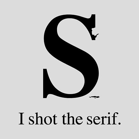
Below are the newsletter designs that Summer A students created for fictional clients. Each team brainstormed about the kind of organization they would use, then designated three adjectives to describe the personality of that organizations. Visual cues such as color, imagery and typeface were chosen based on these cues. Nice work!
Tag Archives: typeface fonts
Lab Week 6: Newsletter Design
In lab this week each creative team was tasked with coming up with a fictional organization. Teams then assigned three descriptive words to that organization, established a target public, and chose colors, content and typeface accordingly. After some brainstorming and rough sketches, the teams went to InDesign. The results really exceeded my expectations. Check out each group’s work below.
Lab Week 4: Helvetica
All of us are prompted in subliminal ways. -Rick Poynor
I love this film for so many reasons. It does a great job of illustrating the Modernist and Postmodernist socio-political climates and their respective effects on design.
In Vis Com we spend a lot of time discussing visual elements and the powerful ways that something such as color, shape or typeface can communicate a certain mood or feeling in the viewer. Helvetica really illustrates this point. As designer Neville Brody points out, if you see an ad for jeans in a grunge font, most likely you will expect the jeans to be tattered and edgy. If you saw the same ad in Helvetica, you would expect a pair of jeans that won’t “stand out from the crowd.”
The film also addresses the question of whether the medium should be the message, or, as designer Tobias Frere-Jones points out, the type should merely be a “crystal goblet,” serving only to pool and organize information.
Lecture Outtakes: Typography
We talked type on Thursday.
There are so many amazing typography and design resources on the web, it can get overwhelming. I keep emailing myself this stuff. There’s got to be a better way. Below are only a few sites that I’ve stumbled across.
Smashing Magazine is a wonderful design resource in general, and their font round-up is fun and inspiring. Dafont is also a fun site for cool, free font downloads for personal use (make sure to check the license terms that generally come with each download!).
At The Phraseology Project, enter a word or phrase, and their team of awesome designers will make it look pretty.
Check out Fonts in Use for beautiful design examples that incorporate every typeface under the sun (even . . . Comic Sans? Gulp).
Typographic Posters has some designs worth checking out as well.
Finally, many of you raised some very good questions about the licensing of fonts, copyright, etc. There is no quick layman’s answer, but Mark Monlux at the Graphic Artists Guild provides the most succinct answer.